4 Ideas for Increasing Conversions on Your Website
By Intrigue
Email marketing has proven to be the most effective of all marketing channels – even more effective than social media! With email marketing being so important, you need to convert your website visitors into valuable email leads.
So how do you build an email list packed with potential customers?
You already spend so much money on generating traffic to your website, so why not focus on converting these visitors into valuable email leads? You might already have an email signup form on your website. But how many of your visitors actually sign up? What if you could increase that number just a little bit?
We’re here to help you do just that!
The most efficient way of generating email leads directly from your website is through lead capture forms. Using lead capture forms on your website can increase your conversion rate by 2-5%. Lead capture forms come in many different variations, and to get the most out of them we need to understand how they work, and how to use them.
I’ve come up with four ideas on how to use lead capture forms on your e-commerce website that will undoubtedly increase your conversions – so let’s get started.
1. Fishing for leads with popups
Even though popups still have a fairly bad reputation, you can’t ignore the facts – they work! Simple as that.
Popups have a higher conversion rate than sidebar opt-in forms, and the explanation is relatively simple. Popups force your visitors to decide whether or not to sign up, whereas sidebar opt-in forms can easily be ignored or overlooked.
Popups are usually time-based, meaning that they pop up on your visitors’ screen a certain amount of time after they’ve entered your site.
Popups catch your visitors’ attention, but it’s your job to convince them to sign up. Look at it this way – the popup is your fishing pole, but you can’t catch any fish without bait. In this case, your content is the bait. Give your visitors an incentive to sign up. This could be an exclusive offer, free shipping, a free ebook, a discount voucher, etc. When you offer your visitors something in return for their email address, they’re much more inclined to sign up.
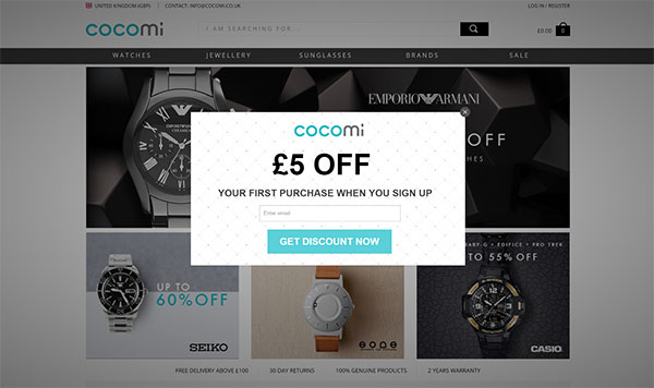
Look at how Cocomi, uses a popup with a discount on their website to get more signups.
2. Slide-ins are the new black – or at least they should be
Slide-ins a not as commonly used as popups, but the benefits can’t be disputed.Slide-ins work similar to popups, but instead of popping up on the screen and blocking the website content, they slide in from the right or left hand corner of the screen. Here’s an example of how Eva Solo uses their slide-in.
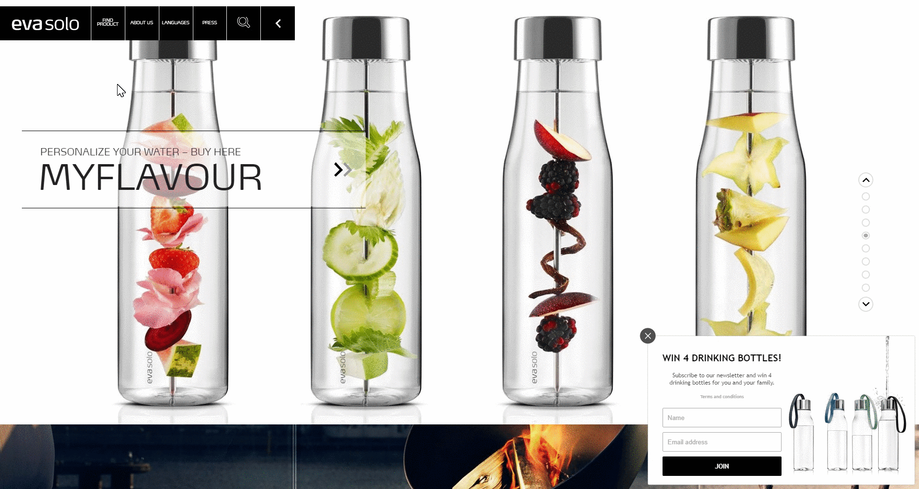
As you can see, slide-ins are not as intrusive as popups, and they also allow your visitors to keep browsing the page without having to close the slide-in.
Slide-ins can be triggered based on a variety of different settings:
- Time based: A time based slide-in will slide in after a certain amount of time.
- Scroll based: The scroll based slide-in will appear after your visitor has scrolled a certain percentage of the page.
- Manual trigger: This one lets you trigger your slide-in in almost any way you can think of. You can trigger it based on a specific URL path, based on where your visitor is coming from (facebook, email newsletter, organic source, etc.), and many more.
So how do you use slide-ins to capture leads on your website?
Again, you should give your visitors an incentive to sign up. The content is always what ultimately convinces your visitors to sign up. But there are other factors to consider as well.
We are all very busy people, and whenever we do something—literally anything—it has to happen in a very easy and time efficient manner. Don’t make it complicated or time-consuming for your visitors to sign up. It shouldn’t take more than a few seconds. Focus on getting the most important information—which is their email address—and nothing more.
Some might also want the name of the subscriber, but keep in mind that the more input fields you add, the more your conversion rate will decrease. I would recommend using no more than two input fields. Every time you add an input field, your conversion rate decreases by 50%. So always ask yourself: do I really need this information in order to get value from this lead? The answer is usually no.
As humans, we are, by nature, very visual beings. Adding images or pictures to your slide-ins can furthermore increase your conversion rate by more than 100%! These images and pictures should of course also be relevant to the content of the slide-in. If you are offering an exclusive deal on a pair of sneakers, your image should be of those sneakers.
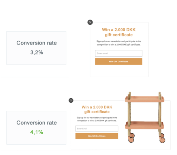
The above image, is a split test done with two almost identical slide-ins. The only difference is that one includes an image and the other one doesn’t. The one with the image has a conversion rate of 4.1%, which is significantly better than the one without the image with a conversion rate of 3.2%.
You can increase your conversion rate even more by creating content in your slide-in that is specific thepage your visitor is browsing, and not just relevant to your site in general.
For instance, if you run an ecommerce with sporting equipment, and your visitor is browsing the page with tennis equipment, your popup content should be about tennis. You could show a great deal on the newest tennis racket, or offer them a free 4-ball can along with their next purchase.
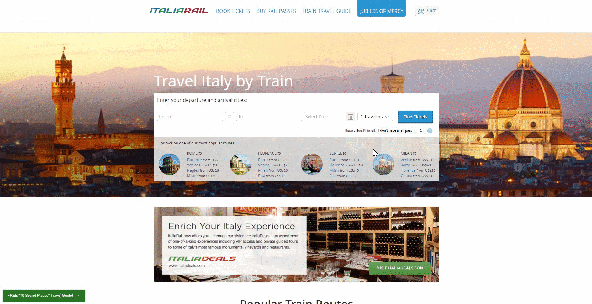
See how ItaliaRail uses a page specific slide-in on their travel guide page.
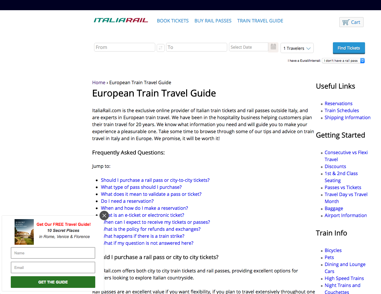
Italiarail offers their visitors a free travel guide, which is very relevant to that specific page as the visitors are already looking at travel guides.
Offering your visitors something relevant to what they were just browsing increases your chances of converting them into leads.
Get A Better Website Than Your Competition
Find Out How
3. Rouse your visitors’ curiosity with a powerful teaser
A teaser is a little sentence or picture that can help trigger your curiosity and convince you to take a closer look. Did you know that you can add a teaser to your slide-in? Well, you can—and you should!
The teaser sits as a little bar at the bottom of the screen when your slide-in has been closed down.
Here’s an example of a slide-in with a teaser on Kapten & Son’s website.
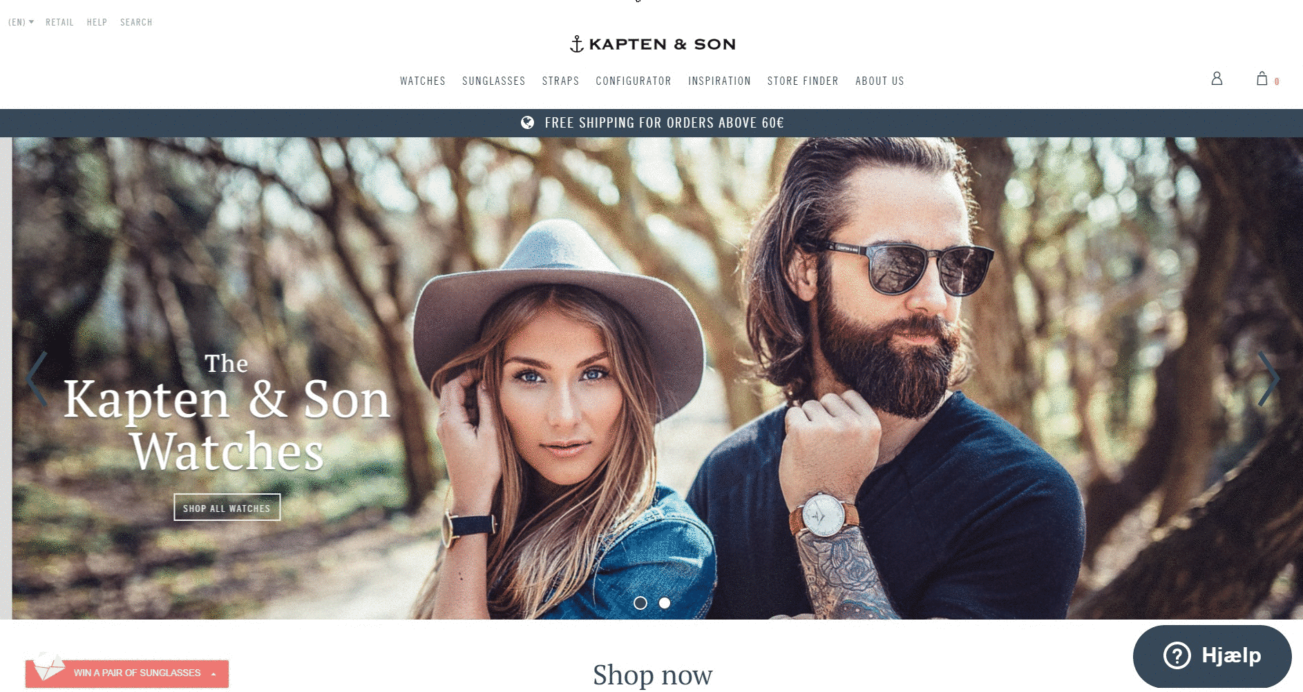
Notice that the headline of the teaser “Win a pair of sunglasses” is relevant to the content and message of the slide-in.
Some of your visitors enter your site with one purpose—to buy something. They have already done their research and decided that it is time to buy. They know exactly where to go, and don’t want to be disturbed by a popup or a slide-in, so they close down the popup or the slide-in and never see your message.
By adding a teaser, your visitor simply minimizes your slide-in, and can reopen it once they are done with their purchase. Now you just need to convince them to reopen it—and how do you do that?
You create a compelling headline that will show on the teaser. You headline should function as a CTA that will trigger your visitors’ curiosity and make them reopen the slide-in.
Check out this blog post on how to create effective CTA’s: https://sleeknote.com/7-invaluable-call-to-action-tip/
4. Catch your abandoning visitors with exit-intent
Exit-intent triggered popups are the most effective tool to convert or re-engage your abandoning visitors. People usually have a very short attention span, and don’t stay on a website for very long. You can use the exit-intent to convert or re-engage your visitors before they leave.
How does it work? It’s pretty simple. The exit-intent triggers your popup when a visitor is about to leave your site.
The exit-intent should always be a popup—if you choose to go this route! It’s your final chance to convert your visitor before they leave, so you need to catch their attention. Once again, your content should be relevant to the page your visitor is on.
Your exit-intent popup should always be easy to close down. Many websites use popups without a closing button hoping that the visitor will just sign up to close it down. However, the results are usually that the visitors close the whole page down just to get rid of the popup which is definitely not the intention of the exit-intent popup.
Make your popup easy to close down, so that even though your visitors might not be interested in your offer, they can close the popup and continue browsing your site. If you can’t convert them, you should try to re-engage them.
Exit-intent popups also have the benefit of not disturbing or interrupting your visitors in something important like a purchase. When the exit-intent popup shows, the visitor has already decided to leave the page and is obviously finished with whatever they were doing. Lastly, it has also been proven that using exit-intent popups on your website has no negative effect on your bounce rate.
That’s a wrap—now over to you!
No matter what kind of lead capture form you decide to use on your website, it should always be relevant to your audience and the product you are selling.
Use popups when you want to catch your visitors’ attention and then win them over with a great offer. Slide-ins are perfect for getting your visitors attention without disturbing or interrupting them, and with a compelling teaser, you ensure that they always have the possibility of reopening it and taking you up on your offer. Lastly, you should try the exit-intent popup to convert or re-engage your abandoning visitors.
There are many ways to increase conversions on your website, and hopefully, you’ve learned a thing or two about using popups or slide-ins to do so.
These were my ideas, and I would love to hear your ideas as well! What have you done to increase conversions on your website? What worked, and what didn’t? Share your story in the comments below.